Hello, friends!
Writing a book is hard, but sometimes, I feel like the writing part pales in comparison to the task of getting people to read your book. Part of getting a potential reader’s attention is an eye-catching cover.
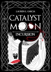
So! I have a task for you, should you choose to accept it. Here we have two amazing potential covers for Catalyst Moon: Incursion.
Option #1, created by the lovely and talented Natalya Posukova:

And Option #2, created by Inkitt’s own (equally lovely and talented) Linda Gavin:

Now, I won’t try to influence you by stating my preferences or thoughts, but I want to hear what YOU think about either of these! Which do you prefer and why? Which would make you go “OH HELL YES” and snatch it off of a bookstore shelf?
Leave a comment below and let me know! 🙂
Thanks, and stay awesome!
~Lauren
I much prefer the first cover. It’s more original, more intriguing and has a fantasy feel to it. The second cover is boring and looks like the typical Twilight tween stuff I see on shelves, which doesn’t appeal to me.
LikeLike
I really like the first cover the best. It is more artistically appealing and has sort of a medieval feel to it which makes it way more interesting than the second cover.
LikeLike
[gasp]
I actually prefer the 2nd cover. The first cover is gorgeous! But if I came across the 2nd cover in a bookstore, I would still want to pick up the book and hopefully buy it. I liked Twilight and its related genre for the ridiculous beach reads I wanted them to be so if that’s why Cover 2 is pinging my radar, then so be it.
(And it’s no bad thing to be called a “beach read” anyway! I first read Tolkien while on the beach! TOLKIEN. Because I am a crazy person).
The TL;DR summary: Both cover choices are lovely but I personally would gravitate towards #2 in a bookstore slightly more than #1, maybe. But #1 is still gorgeous and fascinating!
Sorry this isn’t more helpful 😦
LikeLike
Seeking readers’ opinions is the whole point! 🙂 Thank you for your insights! ❤
LikeLike
I much prefer the first one. It feels more like a fantasy book and is more eye catching whereas the second option feels more generic. The art work as well is very intriguing and just more interesting overall for the first one. I would be more likely to gravitate towards the first one for that reason as I often find my eye drawn towards the artwork before a photographic styled cover.
LikeLike
The covers are not what attracted me to click on the email’s link and end up over here; it was the title of your novel. Why? Because I love to stare at the moon and I was immediately intrigued about your possible reasons for choosing to call it that. I thought, “The moon as a catalyst to what? Hmm…” Now that I’ve got that off my chest, I’ll say that the first cover – although gorgeous – is also too busy. The second one is simple and the color palette draws attention to the title and to the beauty of the young lady. The ravens and fog make bring an element of intrigue and mystery to the cover; echoes of Edgar Allan Poe. My fingers itch to open that book! May your work be well received by critics and readers alike, and become a bestseller.
LikeLike
The second one.
LikeLike
I choose the second because it made me actually look closer at the detail of the cover and that alone makes me want the book. The first is just too busy for my tastes. I like smooth, fluid and easy on the eyes.
LikeLike
The second one catches my eye. I like a minimalist look that stands out. The theme is centered and draws attention to the title. I’d definitely pull this book from a display.
LikeLike
Its like you read my mind! You seem to know so much
about this, like you wrote the book in it or something.
I think that you can do with some pics to drive the message home a bit, but instead of
that, this is excellent blog. A great read.
I will certainly be back.
LikeLike